ShopDreamUp AI ArtDreamUp
Deviation Actions


Suggested Deviants


Suggested Collections


You Might Like…


Description
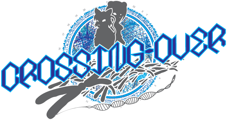
I probably spent way more time than was expected of me, mostly on the Circos graphic in the back. I just thought it'd make the logo look really sweet. This isn't my story, but I'm helping the author/artist out on getting the web comic off the ground. I know that can be tough.
Image size
770x407px 160.06 KB
© 2010 - 2024 dystar
Comments3
Join the community to add your comment. Already a deviant? Log In
Okay Ill do this systematically for ya buddy. The Good, the bad, and the ugly.
1.The Good:
The design overall flows together very well. The color balance is a nice contrast and appealing to the eye. It draws direction as intended for the human mind to take easily as we read from left to right and my focus automatically falls to the text to be read.
2. The Bad:
The only thing with this piece that I dont not like (and this is just my honest opinion and fair critique) The white fill inside you text, I would have done without and allowed the viewers to see through the spaces in text. It looks like you had a stellar logo and just put a layer of text directly on top of it and the text steals away from the logo bc its so full.
3. The Ugly:
None!, bet you were worried though. XD.
Overall I say 8/10.
Great work.